
Wikipedia talk:WikiProject Countries/Archive 2
| This page is an archive of past discussions. Do not edit the contents of this page. If you wish to start a new discussion or revive an old one, please do so on the current talk page. |
Naming conventions
Up until recently we followed the convention to use the short, common name for a country as title for the article. This was mostly decided on Talk:China. However there has been major disagreement to this policy when applied to Ireland, see Talk:Republic of Ireland. There's also been related discussion on the WikiEN mailinglist here: http://www.wikipedia.org/pipermail/wikien-l (December 2002 archive).
The issue is: China (or Ireland) is not wholly the same as the current state that is commonly called that: the People's Republic of China (and the Republic of Ireland). For a more complete picture we should have a separate article for the civilisation as a whole, distinct from the Project template page for the nation-state.
I think we all agree that this is more accurate. However, this does have two major consequences beyond a simple renaming:
- Other cases: China and Ireland are relatively clear-cut. However, there are many cases where the current state is not wholly comparable to the civilisation that is associated with it. Examples: Germany (Holy Roman Empire, German Empire, Nazi Germany, West Germany & East Germany) or Greece (Modern Greece, Ancient Greece, Byzantine Empire). As is apparent, we already disambiguate to an extent, but not for the "overall" name. Are we going to restrict template articles to mostly just the current state, in particular the History section, and leave the general concept of a civilisation to a meta-page and separate all historic instances of a country into distinct articles? How do we name the nation-state article if not by the common name?
- Links: There are many links on Wikipedia that currently assume there's only one concept of a country/civilisation name. These will need to be checked and changed to that concept that most closely resembles the reference. This also ties in to usability, as many people would expect the current state at the convential name, not the more accurate greater civilisation, which can also be argued vice-versa. Many new articles may be written by people expecting to find one concept or the other at the other end of the link.
All-in-all, this could entail quite a bit of work. What shall be our guidelines for determining a clear policy, as logical as possible? -Scipius 19:53 Dec 11, 2002 (UTC)
- Is anybody at all interested in this issue? I would like to get back to applying the template to country articles, but this issue will have an effect on several of them. Are we going to go back to how we did things previously, are we going to make an exception for Ireland alone or are we going to split country articles more accurately along historical and/or political boundaries? -Scipius 20:25 Jan 12, 2003 (UTC)
- Still no answers, so I'll take it we're going to make an exception for Ireland and possibly wherever else someone objects to a given name, though no-one has as yet changed China over. Everything else remains the same, though I suspect we'll need to again address this in the future. I'll avoid converting certain dubious countries (Macedonia, Cyprus) for the mean time. -Scipius 18:03 Jan 18, 2003 (UTC)
Stubbish articles
I would very much like to link North Korea from the Main Page since this nation is at the top of the news right now. But this article is in such sad stubbish form it would be embarrassing for the project if I did link it. Could somebody flesh this out per the WikiProject Countries format? I'll see if I can help-out later in the weekend. --mav
- Making the article more visible should encourage improvements to it. Isn't that the point of Wikipedia? --Brion
- I'd love to resume work on the Project, but how are we first going to resolve the above issue? -Scipius 19:22 Dec 28, 2002 (UTC)
Bernard Law has been on the Main Page for some time now and remains an embarrassing stub. My view of the background articles is to show-off a bit - give people an idea of good articles by cleaning-up and expanding topics of current interest. --mav
Public holidays
I have to put the Public Holidays in Germany into a single article, because I had the feeling it won't fit so well into the Germany-article. Is this ok? Any comments? --zeno 09:16 Jan 7, 2003 (UTC)
Placement of education/social structure
I am wondering where should we put information such as education or social structure? -- Taku 05:17 Jan 14, 2003 (UTC)
- Both of those would fit best in the Demographics section. Any lengthy information should probably go straight into its main topic article (Demographics of X). -Scipius 18:03 Jan 18, 2003 (UTC)
Locator maps
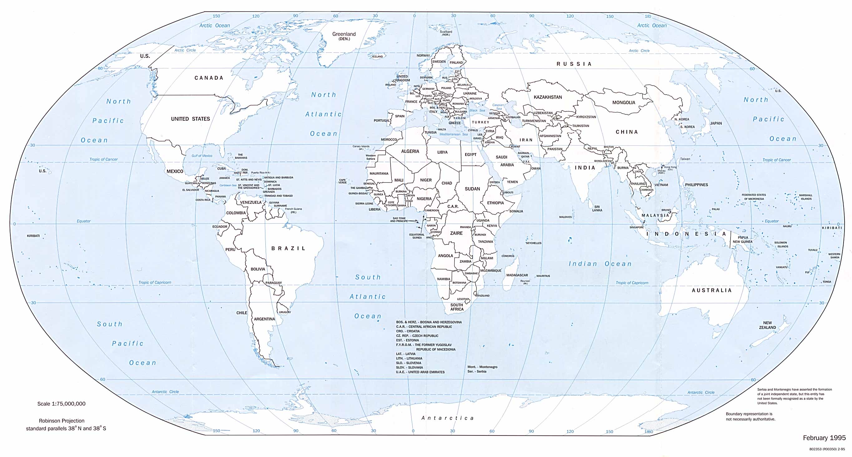
I have uploaded the map that I have used to create a locator map for the U.S. I highlighted the U.S. portions in green and then scaled it down to 30% to create the maps. For example of the locator maps based on the World.jpg image, see United States or Hawaii. Here is the fullsize image that can be used to create the locator maps:
 |
- sfmontyo
- Very cool. But some smaller nations may be too small to pick out of the thumbnail-sized image. For nations in the European Union we could simply have an image of Europe but some smaller S. E. Asian nations may be problematic - especial city states like Singapore. See m:Wikipediatlas for an example using a globe as a general locator and a blown-up flat map to show the outline of the nation. --mav
Come to think of it, a globe also much more accurately represents the true shape and orientations of nations. The Mercator map above, for example, makes Greenland look as if it is twice the size of Australia when in fact it is only 1/3 the size. But then again globes can never show everything at once - but I don't think that is very important to have in each nation article. That type of information can be at earth.
How was this map made? where did it come from?
- here's the URL http://terraserver.homeadvisor.msn.com/ and this is what they say regarding use of the maps:
- The U.S. Geological Survey (USGS) provides the Microsoft® TerraServer site with images and maps of the United States. The images are in the public domain, and are freely available for you to download, use and re-distribute. If you download and use any images, the TerraServer team and the USGS appreciate a reference to our work on this project
- -sfmontyo
- here's the URL http://terraserver.homeadvisor.msn.com/ and this is what they say regarding use of the maps:
I think that the way to go about the small-country issue is to have two maps when needed. Indicate the location of the country on the large map with a fat green dot, and have a second, more detailed map of the country with a minimal amount of geographical context. The green dots may also be used to indicate far-flung island territories.
The only other problem that I can see arising with this map is Denmark, the bulk of whose territory is actually in Greenland. -Smack 00:28 8 Jul 2003 (UTC)
Material moved from Wikipedia:Village pump on August 12 by Wapcaplet
Having recently completed the daunting task of making maps highlighting thousands of U.S. counties, I'm surprised that there do not seem to be any (or at least very many) maps highlighting countries of the world. Many countries have nice maps taken from the CIA World Factbook, but there are few which show a country's location on the globe.
I'd be perfectly happy to work on this, provided it hasn't already been done, since it'd be good to have maps with a similar color scheme and appearance to the completed U.S. ones (for all U.S. states and all counties within those states). Finding a nice, high-quality outline map of the world is the first step, of course. I'm thinking a map similar in style and size to the U.S. map shown on, for example, Texas, showing the globe, with a highlighted county. These can be conveniently placed either on the main article for each country, or, probably more appropriately, on the "Geography of X" (for example, say, Geography of Canada). Thoughts? Criticisms? -- Wapcaplet 15:32, 12 Aug 2003 (UTC)
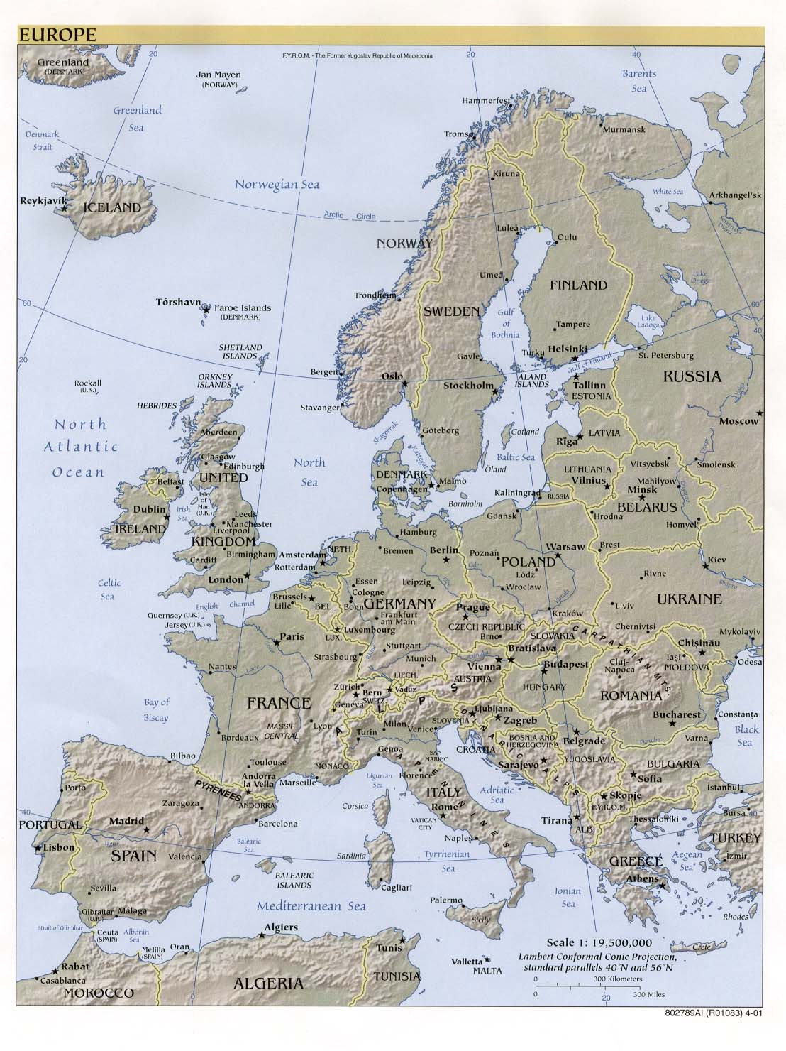
- I think it's a great idea. However, for some countries, especially those in Europe, it might be best to highlight them on a map of the continent rather than the world as they might not be very visible on a world map. - SimonP 16:11, Aug 12, 2003 (UTC)
- I think this would be a great addition to the 'pedia. Many articles on certain countries have maps of the country, but give no context as to where on the globe they reside.
- Just a thought, in line with what SimonP said, some countries are rather tiny and two images may be necessary to convey where it is located. For example, one large view of the entire globe may need an arrow pointing to an almost imperceptible red dot. A second image would show a moderately zoomed-in image of the country and it's relative position to adjoining nations. Then, of course, there would be the main image which would just be of the country itself, which you are not proposing to provide (since they should already have them). —Frecklefoot 16:18, 12 Aug 2003 (UTC)
- It's mainly a question of aesthetics, but what I don't like at the Texas example is the coloring -- white/blue/red might be cool for US states, but for highlighting countries all over the world (which is a good idea, but in my opinion more "Politics of X" than "Geography of X"), I'd suggest some colors that aren't political used together -- say, medium grey and orange. -- till we *) 16:21, Aug 12, 2003 (UTC)
Good point about the (relatively) smaller countries; two maps may be necessary in that case, with the world map using circle(s) to indicate approximate location (sort of like we have with Rhode Island, or Aleutians West Census Area, Alaska), and a larger map giving a better view.
As for colors which are not political... that is a pretty difficult task. The red-on-white colors were chosen only for their contrast, so I wouldn't be terribly opposed to orange (though, it would break the established tradition of red-on-white). Blue was chosen for the water because, well, think about it. It has nothing to do with politics; any color combination is going to be interpreted as political by someone, no doubt... -- Wapcaplet 16:29, 12 Aug 2003 (UTC)
- Colours: Maybe an overinterpretation by me. But nevertheless, it would be quite nice to see with one look at the map if this is a sub-national entity (colored red) or a national entity (colored don't-know-yet). -- till we *) 16:39, Aug 12, 2003 (UTC)
- Personally, I really like the contrast of the red against the white. The color of blue used for the water isn't the same shade of blue that would be used to represent the US flag, so I don't find it objectionable. Personally, I never interpretted the red, white, blue (and greys) as any sort of political statement. I just thought it the color were used because they were the most appropriate for the task of indication. —Frecklefoot 17:34, 12 Aug 2003 (UTC)
End of material moved from Village pump
I have begun working on the basic outline map. I looked around but was unable to find a good public-domain basic outline map without country names written all over it, so I have been working on cleaning up the 1995 CIA world map. It uses the Robinson projection, which I think is the nicest-looking one (and more accurate, as far as relative land area goes, than the one sfmontyo used above). I plan to use the red/white/sea-blue colors mentioned previously, unless someone has a convincing reason not to. -- Wapcaplet 20:56, 12 Aug 2003 (UTC)
The basic outline map is finished: Image:World outline map temp.png. Please note that many islands, especially in the Canadian territory, have been globbed together for clarity's sake. Keep in mind this map will be shrunk to 300 pixels wide or less, and many of the details will be lost; additional detail at this level could turn into muck at the smaller sizes, so I've tried to keep things as simple as possible. Many other islands, especially small ones off the continental coasts, have been left out entirely so as not to make the map too complex.
I would greatly appreciate if some other users could take a look at it and see if there are any obvious geographical or other errors. I must admit my knowledge of the world's countries is rudimentary, so I may have overlooked something important, omitted a significant island, etc. It's also possible that the map I based this on (CIA, 1995) has been outdated by changing political boundaries.
-- Wapcaplet 02:46, 13 Aug 2003 (UTC)
- Nice map, Wapcaplet. Well-chosen projection, my part of the world looks (to my casual eye) pretty complete and correct. A very minor point, possibly not worth worrying about, is that Cocus Island and Christmas Island seem to be missing from the eastern Indian Ocean. But a great start! Tannin 04:33, 13 Aug 2003 (UTC)
Thanks! Cocus and Christmas must have been submerged in the flood-fill; I've added them back into my version. Islands like this aren't too likely to be visible in the shrunken versions, but it's good to know that they're there so I can find some way of highlighting them :-) -- Wapcaplet 04:51, 13 Aug 2003 (UTC)
Okay, I've been plodding along working on borders for the Oceania countries and other territories, and decided it might be good to try a demo image at the target size. At 300 pixels, the world map becomes almost illegible; 400 pixels in width is somewhat better:
File:Demo map of world highlighting Germany.png
But I am beginning to have doubts about this. You can just barely tell that it's Germany that's highlighted. Even at 400 pixels, many countries are going to be too tiny. Most of the image's size is "wasted", you might say, on ocean. At this size, all you're going to get is a general idea of where the country is in relation to the rest of the world. There are a few options I can see:
- Use a larger map, or a "click for larger version..." map
- Go ahead and use this map at 300 to 400 pixels; emphasize the relatively small countries where necessary (by circling, etc.).
- Use this map at a small size (300 pixels or so), but augment it with an additional map showing the country in relation to a smaller area (say, a continent map)
- Use a continent map only, and assume viewers know where each continent is on the globe
Ideally, I'd go with (4), but there are many geographically impaired people out there who might prefer to have both. I shy away from (2) because anything smaller than, say, Germany, is going to be a mere speck. (1) might work well, but even at the full resolution (almost 2700 pixels), a few countries will be too tiny (and of course, Vatican City is gonna be invisible at any resolution :-) Thoughts?
An additional question; perhaps someone with better knowledge of any standards on this may be able to answer it. Should I include, for example, the U.S.-dependent territories (American Samoa, Guam, Virgin Islands, etc.) in the "map_of_world_highlighting_USA"? A similar question can be asked regarding France, UK, New Zealand, Australia, and other countries with islands scattered around that are considered dependent territories in one way or another. Highlighting just the mainland would be easiest, of course. I'm just curious if these areas are normally considered part of the mainland country, or if they should be given a separate map (since of course we'll have articles on them).
Any other comments or suggestions would be welcome!
-- Wapcaplet 00:02, 14 Aug 2003 (UTC)
- I would go for (4). There are articles on the continents for the geographically impaired. -- Gustavf 09:07, 14 Aug 2003 (UTC)
- See below. -- Wapcaplet
- I agree. (4) looks like the way to go. Of course, what do we do with continentally-sized countries (Russia comes to mind - adding it to either the Asia or Europe continent maps would cause both to be hugely 'distorted', and would make it harder to see the smaller countries on each)... Thoughts?
- James F. 10:41, 14 Aug 2003 (UTC)
- See below. -- Wapcaplet
- I think Russia (others might be Australia and China) would probably be best viewed on a world map. I see no problem with using a world map if a continent map is not suitable. -- Gustavf 13:03, 14 Aug 2003 (UTC)
- Agreed. For the very large countries, I will use the world map; there's no reason not to. -- Wapcaplet
- A locator map showing the country itself in one color and the dependencies in another would be best, I think. One neither ignores dependencies, nor the distinction. - Patrick 10:17, 14 Aug 2003 (UTC)
- This is a cool idea! I think a green, or possibly purple, may be a good contrast to both the red and blue. Of course, this means I'll need a "key" on the map explaining the use of color. Something like: (red) Mainland / (green) Dependencies. Let me know if there's better terminology than that. -- Wapcaplet
(above comments indented for readability.) Okay, I will proceed with (4) in mind. However (and this may seem like a minor point), I find it interesting that the continent articles do not themselves have a locator map. I will use continent-outline maps to show highlighted countries within that context, but I insist on making similar highlighted maps showing continents in the context of the rest of the globe. The truly geographically-impaired person will be glad.
Though, (4) being the case, it will make much more sense to use a different map projection, especially for North America, Europe, and Asia, which does not distort shape so much. I will get cracking on that :-) I will treat Europe and Asia as separate continents, for the simple reason that it would be too crowded to cram them both into one map.
-- Wapcaplet 15:48, 14 Aug 2003 (UTC)
Progress report: I've finished large outline maps for Europe, Africa, Asia, and South America. The source maps I'm using are from the 2001 CIA World Factbook, like this Reference map of Europe. These use a better projection for each region to minimize distortion. Anyway, it appears that they use a separate map for the Middle East (Turkey, Iraq, Qatar, etc.), so they will not really be "continent maps" per se, but convenient divisions of territory for the purposes of highlighting stuff. Central America is separate, as well, and possibly others.
I will probably go ahead and make outline versions of several of the other maps in that series, even though they may not be needed for this project. They may be useful sometime in the future.
-- Wapcaplet 16:10, 15 Aug 2003 (UTC)
I've uploaded the following images to highlight continents:
- Image:Map of world highlighting Africa.png
- Image:Map of world highlighting Antarctica.png
- Image:Map of world highlighting Asia.png
- Image:Map of world highlighting Oceania.png
- Image:Map of world highlighting North America.png
- Image:Map of world highlighting South America.png
- Image:Map of world highlighting Europe.png
I was just about to add them to the "Geography of X" articles, except there do not seem to be such articles for Europe, Asia, North America, or South America. (Oceania, of course, belongs with Australia). I don't know if they are yet to be created, or if they've been merged with the main articles, so I'm not really sure where to stick these images. They could go on the main article, I guess, but most of those already have several large images. Suggestions? -- Wapcaplet 15:23, 16 Aug 2003 (UTC)
- some comments at Wikipedia:Requests_for_comments#World_map - too late? Martin
Flags
Rather than linking to flag of the Bahamas (red link), I made a direct link to the larger version of the flag (see Bahamas). This also de-orphans the larger version. Is this a good/bad idea? Only where there is not already a flag of X article, of course. Martin
Just a quick note: I've used a variant of the country table at Gaza Strip, but RK has raised some good points and I'm unsure of how to proceed. Do you folks have any advice for dealing with disputed territories like this one? Martin
Reference section
I see KQ unilaterally added a reference section to the template and to various country articles. I would suggest that this is not strictly necessary for the main country article, at least not in the main text. It would most definitely be appropriate for the section subpages as many contain little but information from those sources (at least until we decide on a template for them), but the main page is somewhat different in that its format is homegrown and its text is not always from the Factbook or the State Dep. pages and even when it is it has often been altered or verified with other sources. The texts are likely to be further amended in the future.
There seem to be two references out there at the moment. Both mention one source being the 2000 Factbook, but this is not entirely correct. I myself only use the 2002 Factbook and ignore the existing year 2000 subpages, which frequently contain out-of-date info. One says Much of the material in these articles is from these sources, but given that the main country page is a repository for links to a great many articles that often have nothing at all to with those sources, this is incorrect or at least a little misleading.
Note that neither requires us to add a mention of them, though giving credit where credit is to some extent due is always laudable. However, it does unnecessarily clutter up the template with yet another section. As mentioned, the country articles may evolve further and what should we do if an article contains nothing but some vestiges of words from these sources? Does that still warrant such a prominent mention? Some of the data may have come from the Factbook, but that's hardly the only source for them as the CIA had to get them from other sources as well.
I would suggest we create a permament boilerplate reference to these sources at the top of the countries' talk pages. This way anyone who is seeking more information about a country or wants to point out an error will see two sources to verify that we've used ourselves. It would also give us more room and we may want to mention other sources. I'll give the following text as a starter, please feel free to add to it:
Public domain text from the CIA World Factbook website and the U.S. Department of State website was initially used as a base for this article which may still to a greater or lesser extent incorporate texts from said sources. -Scipius 19:59 29 May 2003 (UTC)
- An alternative or supplement (as you see fit) to this is what I have been doing for U.S. cities, counties, and states. I place references in Geographic references and then link to them from the articles. Thus we have a repository of sources for our articles. I sometimes link to them using superscripts (like you would might see in a published work)1. Take a look and see what you think. -- Ram-Man
Table-less design
I've experimented with a table-less design on the Philippines. Do you guys think that this is better than the tabled version? I personally think that the tables look too cluttered, plus the fact that the Area, Population, and Independence table rows makes little sense when the article is viewed in a text-only browser like Lynx. —seav 08:54 9 Jul 2003 (UTC)
- All those divs look just as messy to me in WikiText as the table code with no improvement in box function or appearance (it looks worse, IMO). We already plan on replacing HTML table markup with wiki table markup. --mav
Demonyms
It may be a little late in the day for this, but I think it would be useful to add a table box that looks like this:
| Demonym
- Adjective |
Spanish |
What do you think? - Montréalais
- Better yet place that information in Wiktionary and provide a link to the Wiktionary article (see dog). --mav
I don't see why that would be better. - Montréalais
- Because it updates Wiktionary with dictionary-type data and keeps Wikipedia free of it. --mav
I don't know. To me, it's the sort of thing I'd expect to find in an encyclopedia, not a dictionary. (I don't find the word "Spaniards" in the entry for "Spain" in my Canadian Oxford, but I do find it in the encyclopedia section of my Larousse.) I think forcing people to switch over to Wiktionary to find that information is cumbersome. To a certain extent, it is about the people and the country, not just the word. - Montréalais
Comments requested
Moved from Wikipedia:Village pump on Saturday, August 2nd, 02003.
I would appreciate comments on my suggestion on Wikipedia talk:WikiProject Countries. - Montréalais 18:01 25 Jul 2003 (UTC)
Independence "recognised"
I don't really understand what date should be given for this. Recognised By whom? Typically, a country is 'recognised' by other nations over a period of some years.
- Recognized by the nation they were previously a dependent of. --mav 05:04, 3 Aug 2003 (UTC)
Non-recognized countries
Moved from Wikipedia:Village pump
Is it just me are both the Chechnya and Somaliland articles neither NPOV nor entirely accurate? Both countries are basically unrecognized and the Somaliland article went so far as to modify the CIA factbook map, making it look like Somaliland was listed in the CIA factbook as a separate country (not that the CIA is the authority on what's a country or not, it just seems like the contributors to these articles are advocating independence rather than presenting facts. Daniel Quinlan 07:07, Jul 30, 2003 (UTC)
- I don't see the POV in Somiland - it clearly names it "territory" instead of country, and it states that it declared independence, but did not receive any international recognition of it. And making a map to show the territory is much better then many words to decribe it (OK, except for blind who need the words) - modifying the CIA map is probably the easiest way to create such a map. I guess it's just because you're used to see CIA maps for countries which makes you think it implies it being a country. andy 07:59, 30 Jul 2003 (UTC)
- "Territory" is the land and waters under the jurisdiction of a government. It's nearly synonymous in that context with "country" or "state".
- Wrong-wrong-wrong-wrong-wrong. A territory can be not only the land and waters under the jurisdiction of a government, but can also be a defined (either officially by the government, or more or less loosely by others -- this can be taken to quite a degree of informality) part of the area of jurisdiction of some government (ex. the Kansas-Nebraska Territory of former days). This doesn't imply the soverignty of the "territory" in question; it might be a country, or it might not. --Daniel C. Boyer 17:20, 1 Aug 2003 (UTC)
- I don't have a problem with altering CIA maps when they are inaccurate, but altering the map to look like every other CIA map subtly implies that a government is recognized at some level. (On reading tha CIA article about Somalia, it does sound like the declaration could someday be recognized, but that's not at issue here.) On re-examining the article, I think some small touch-ups can probably fix it up. List the countries, if any, that recognize it. Note disputed status and recent history better, etc. Daniel Quinlan 08:48, Jul 30, 2003 (UTC)
- "Territory" is the land and waters under the jurisdiction of a government. It's nearly synonymous in that context with "country" or "state".
- However the map in the Somalia article is definitely POV - as it shows Somalia without Somaliland. That one need replacement. andy 07:59, 30 Jul 2003 (UTC)
- Somaliland is not recognized by a single government. Replacing the Somalia map before Somaliland is recognized anywhere is premature and inaccurate. Daniel Quinlan 08:48, Jul 30, 2003 (UTC)
- Maybe the map could be modified in a different way as not to imply Somiland is not part of whichever countries it broke off of. (Maybe using dotted lines would help.) --Jiang 08:03, 30 Jul 2003 (UTC)
- Yes, and coloring the rest of Somalia in a different color then the other sorrounding countries would help as well - it would show that the remains of Somalia is on a different status then e.g. Ethopia. I'll try to paint something for the two maps later, unless someone else is faster of course. andy 08:22, 30 Jul 2003 (UTC)
- That would probably do most of the job. Probably should also be labeled as "region of Somalia claimed by Somaliland" or some such. Daniel Quinlan 08:48, Jul 30, 2003 (UTC)
- Done. I created two new maps from the original CIA map, which should visualize the status a bit better. The old JPEG maps (now they are PNG) I placed in Wikipedia:Votes for Deletion. andy 12:38, 30 Jul 2003 (UTC)